
The Guardian
Client
The Guardian
My role
UI Design, UX Design, Prototyping
Credits
Contributions Team
The context
User engagement was dropping after people donated money to the Guardian, and we wanted to improve that metric since contributions are a vital part of the company’s sustainability. We looked at the current experience, then designed some prototypes and conducted user interviews to gain insight into their attitudes towards the different types of engagement.
Spoiler: 🤫 the design solution increased the metric to a whopping 46%.
Previous experience
The design of the experience started to look dated and presented a challenge in understanding the different actions that could be taken after contributing through the website.
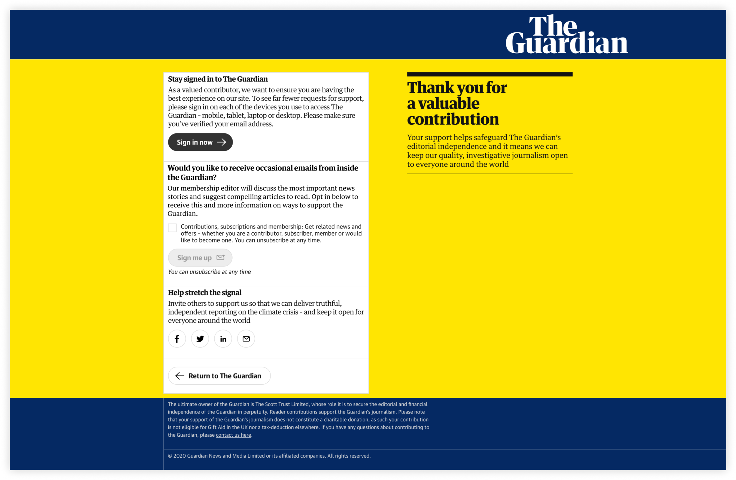
After making a contribution, users would be presented with three options: sign into their account (if relevant), sign up for a newsletter, and share the support via social media.
We identified an issue in the way these options were presented, and looked for ways to improve the usability. In addition to this, we had been doing quite a bit of work over the previous months for a feature called contribution reminder (but that’s a whole other case study, soz), and that needed to be added into the mix too.
This led to the design of a few prototypes that were tested with a pool of our users.

After some iterations, we refined two sets of prototypes that we believed would produce the best results, and used them to start gathering user insight.
We decided to solve the problem with a mobile-first approach, since the limited screen real estate dictated by the size of the device would present the most constraints to work with. After solving the problem on mobile, desktop would be a breeze 💅🌬
Test A: vertical vs horizontal layout
We spoke to ten people in our usertesting.com panel who had previously contributed to the Guardian, across the UK and US. We wanted to find out which layout, if any, would help them take any more actions and digest the content better.

Vertical layout

Horizontal layout
Ultimately, all but one of the participants in the study preferred the vertical layout option, rather than the horizontal scroll one. They described it as cleaner, easier to understand and to remember the options, quicker for making a choice. Users felt that this was a more appropriate design given they had just made a contribution, and didn’t want to spend time going through more options.
Test B: copy-led vs illustration-led
Same deal, we interviewed ten of our contributors on usertesting.com, across the UK and US, to find out which layout they found more inviting and easier to use.

Copy-led layout

Illustration-led layout
This time, the preference wasn’t as obvious. Or so we thought…
Although the illustrations were generally well-received, and helped draw the eye to the content, they ultimately caused confusion at times, in regards to their meaning. Users more or less unanimously agreed on the fact that the information was the most important thing they wanted to see during the experience, and it shouldn’t be potentially sacrificed, risking user frustration.
The “thank you” message was flagged as not prominent enough, which reinforced our belief that whilst the prototype was to test specific actions, we shouldn’t lose sight of the primary purpose of the page, which was to create a space that makes our contributors feel grateful for their support.
In a nutshell:
Following user research recommendations, we needed to:
Create a flow where users could see their options quickly and easily. This was consistently seen as the strongest need from the thank you page.
Ensure the priority of the design is to communicate gratitude to contributors; the actions should be secondary.
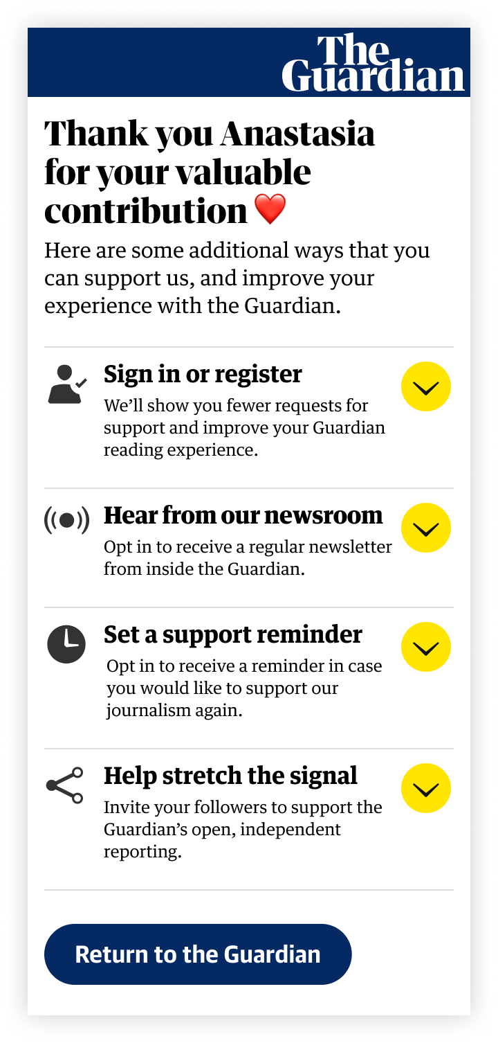
Acknowledge that the reminder is for those who tell us they “need a nudge” and might not be for everybody.
The social media (share) aspect of the experience is, for contributors, the least important action of them all.
Make sure that the solution would adapt to users who were signed into their account at the moment of the contribution (this caused confusion for people who were signed in but didn’t initially understand what it meant to be “signed in”).
Final designs
The first main point we addressed, as per user research, was to communicate gratitude. Instead of a generic “thank you” message, we now implemented a dynamic element that would grab the name of the contributor from the details submitted at the time of the donation, incorporating it in the confirmation screen, making feel the experience more human and personalised.
The actions, on mobile, were displayed inside an accordion. This allowed contributors to quickly see everything at a glance and quickly find out more information without necessarily committing to a tap to a separate page, giving them plenty of opportunity to explore and make decisions in their own time, with next to no friction.

Final mobile designs
On desktop, we took a modular approach. This would allow us to show, hide and shift around elements depending on specific data we wanted to monitor, or depending on which actions had already been taken recently by some contributors (eg. someone would already be signed up to a newsletter).

Final desktop design
Result: 46% increase in actions taken
The designs were A/B tested over the course of 2 weeks, against the original experience.
The number showed that user engagement for the post-contribution actions increased significantly of 46% across mobile and desktop.
